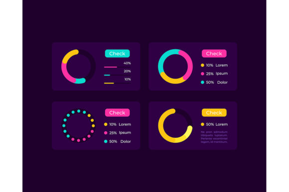
Pie Charts UI Elements Kit for Modern Dark Interfaces
Data visualization is often the breaking point in digital design. You have complex analytics, user statistics, or financial breakdowns that need to be communicated instantly, but standard charting libraries can feel sterile or clash with a carefully crafted dark mode aesthetic. The Pie Charts UI Elements Kit solves this friction by providing pre-designed, vector-based components specifically tuned for modern interfaces. Rather than building circular graphs from scratch or fighting with CSS borders and SVG paths, designers can deploy polished infographic elements that maintain visual consistency across mobile apps and web dashboards.
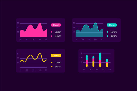
This collection goes beyond simple geometry. It includes infocharts with integrated percentage labels, isolated vector icons, bar chart variations, and complete dashboard templates. Because the assets are available in EPS, JPG, PNG, SVG, and AI formats, they bridge the gap between static presentation decks and interactive high-fidelity prototypes. For creators working within a dark theme interface, these elements offer immediate contrast and legibility, ensuring that data remains the focal point without overwhelming the user experience.
Designing for Clarity in Dark Mode Environments
Dark themes present unique challenges for data visualization. Low contrast ratios can make thin lines disappear, while overly saturated colors can cause eye strain or vibration effects against deep backgrounds. This kit addresses those optical issues through intentional color palettes and stroke weights designed specifically for low-light environments. When implementing these pie charts, the priority should always be readability over decoration.
- Luminance Hierarchy: Use brighter accent colors for the primary data slice and muted tones for secondary segments. This guides the eye naturally to the most important metric without requiring excessive labeling.
- Negative Space: Dark interfaces breathe better with generous padding. Ensure the pie chart has sufficient isolation from surrounding UI elements to prevent visual crowding.
- Label Integration: The included infochart templates place percentages directly within or adjacent to slices. In dark mode, white or light gray typography on colored segments often performs better than external legends connected by thin leader lines.
By leveraging these pre-calibrated assets, you avoid the trial-and-error phase of color correction. The vectors are structured so that adjusting opacity or swapping hex codes maintains the overall balance of the composition, keeping your dashboard professional and accessible.
Adapting Vector Assets Across Platforms and Formats
Versatility is central to practical creative work. A designer might need a crisp SVG for a responsive React dashboard, a high-resolution PNG for an App Store screenshot, and an editable AI file for a client pitch deck. Having all these formats in a single ZIP archive streamlines the production pipeline significantly.
For mobile application developers, the SVG format is particularly valuable. Scalable Vector Graphics ensure that pie charts remain sharp on everything from compact phone screens to large tablet displays without increasing app bundle size unnecessarily. Since the vectors are clean and optimized, they integrate smoothly with animation libraries like Framer Motion or Lottie, allowing you to add subtle entrance animations or interactive hover states without redrawing the geometry.
Conversely, marketers and educators often work in print or slide-based mediums where rasterized images are preferred. The included JPG and PNG files provide ready-to-use graphics for social media carousels, blog post headers, or PDF reports. These static versions retain the dark theme aesthetic, making them perfect for maintaining brand continuity when moving from a live product environment to promotional materials. The ability to switch between editable source files and flattened exports means you never have to recreate the same chart twice for different stakeholders.
Creative Applications Beyond Standard Analytics
While pie charts are traditionally associated with financial reports or server load metrics, their circular form offers broader creative utility. Thinking outside the literal data context can transform these UI elements into engaging storytelling devices.
Gamification and Progress Tracking
In fitness apps, learning platforms, or habit trackers, a pie chart functions less as a statistical tool and more as a motivational indicator. Using the kit’s donut-style variations, you can create progress rings that fill as users complete tasks. The dark theme background makes neon or gradient fills pop, turning mundane completion rates into satisfying visual rewards. Pair these with the included icon set to denote specific achievements or skill categories, creating a cohesive achievement system that feels native to the interface.
Budgeting and Personal Finance
Fintech applications require trust and clarity. The dashboard templates in this kit provide a structural foundation for expense categorization that feels premium rather than utilitarian. Instead of a generic table, use segmented pie charts to visualize spending distribution. The isolated vector icons can represent categories like housing, transport, or entertainment, reducing cognitive load. Users process visual shapes faster than text lists, making budget reviews less tedious and more intuitive.
Educational Infographics
Educators and content creators can repurpose these elements for e-learning modules or video essays. Complex concepts like market share, historical demographics, or scientific compositions become digestible when visualized with consistent styling. Because the assets are modular, you can mix pie charts with the included bar graph elements to show correlation versus composition on the same slide or screen, maintaining a unified visual language throughout the lesson.
Maintaining Data Integrity and Visual Consistency
A beautiful chart that misrepresents data is worse than no chart at all. When customizing these UI elements, adhere to fundamental visualization principles to preserve credibility. Pie charts are best suited for showing parts of a whole with fewer than six categories. If your dataset exceeds this limit, consider using the bar chart alternatives included in the kit or grouping minor segments into an "Other" category to prevent visual clutter.
Consistency extends beyond individual charts to the entire design system. Establish a semantic color mapping early in your project. For example, if green represents revenue in one widget, it should not represent user churn in another. The editable AI and EPS files allow you to define global swatches, making it easy to update the entire kit’s palette if your brand guidelines evolve. This systematic approach ensures that every dashboard template and isolated icon feels like part of a singular, coherent product ecosystem.
Accessibility must also guide your customization. While dark themes are popular, ensure sufficient contrast ratios for users with visual impairments. Test your modified charts against WCAG standards, especially when placing text over colored segments. The kit provides a strong starting point, but your responsibility is to validate that the final implementation serves all users effectively. Adding aria-labels or tooltips in the development phase complements the visual design, ensuring the information is perceivable regardless of how it is consumed.
Streamlining Workflow for Freelancers and Teams
Time is the most constrained resource for freelancers and small agencies. Building custom data visualization components from zero consumes hours that could be spent on strategy or refinement. This kit acts as a force multiplier, providing professional-grade assets that elevate deliverables without extending deadlines.
When pitching to clients, presenting mockups with realistic, styled data visuals demonstrates attention to detail and technical competence. Generic wireframe placeholders often fail to convey the final product's quality. By utilizing these dark-themed dashboard templates during the proposal phase, you help stakeholders visualize the end result more concretely, potentially shortening approval cycles. Furthermore, because the files are industry-standard formats, they hand off cleanly to developers or other designers, reducing friction in collaborative workflows.
Ultimately, the value of the Pie Charts UI Elements Kit lies in its balance of aesthetic specificity and functional flexibility. It removes the technical burden of drawing complex curves and aligning labels, freeing you to focus on what the data actually means for your audience. Whether you are building a SaaS platform, designing an educational course, or crafting a marketing campaign, these tools provide a reliable foundation for communicating information clearly and beautifully in modern digital spaces.